
BRAND SAMPLES FOR TITAN
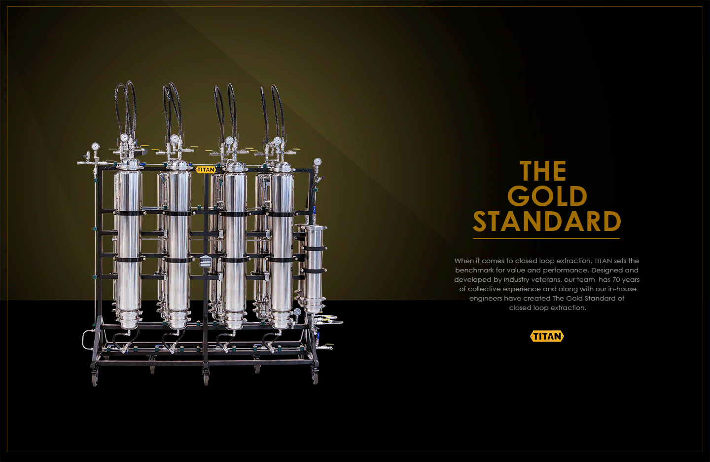
Closed loop extraction systems are not cheap. With that said, the units themselves look incredible. They’re works of art and need to be treated as such when it comes to the design language of the marketing materials. These mockups evoke feelings of confidence and power. The minimal design and use of negative spaces puts spatial emphasis on the beauty and quality of the TITAN system while giving the tag line and proposition statement room to breath and be appreciated.
Consistency in colors, typography and graphic elements are a must to build Titan’s brand equity and this overview provides a mood board for the concept.
Color Usage:
Black: Representative of power, sophistication and mystery.
Gold hue: Evokes feelings of happiness, positivity, and enthusiasm. The cast of golden hues behind the product are psychologically appealing and relative to the audience since extractors are chasing the golden end product.
