
A Visual Language
Graphic Design
The Art of Cognitive Messaging
Just like spoken word, graphic design is a language. What you say and how you deliver it makes all the difference in the world. Whether it be on pixel or paper, I can help you create an emotional connection with your audience.
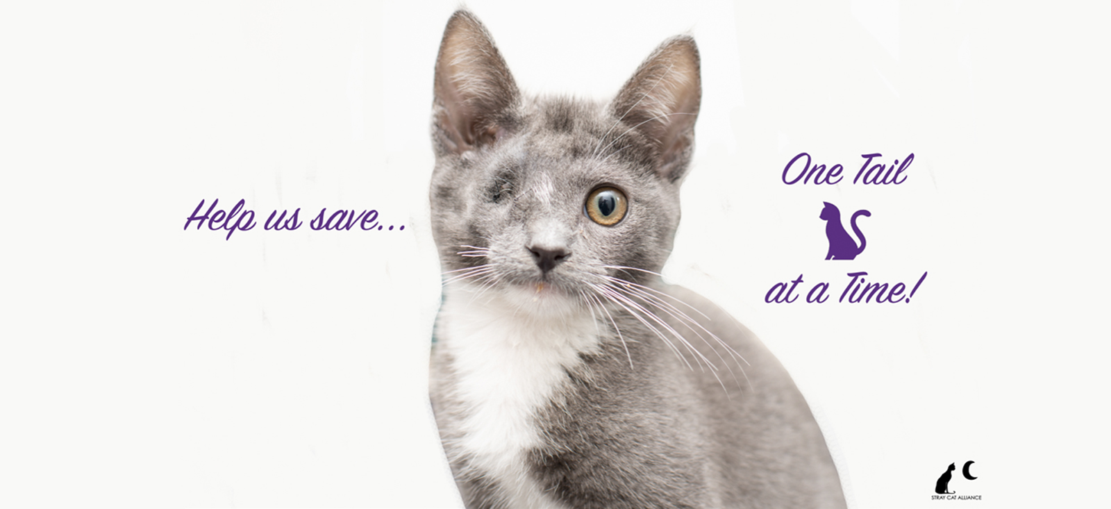
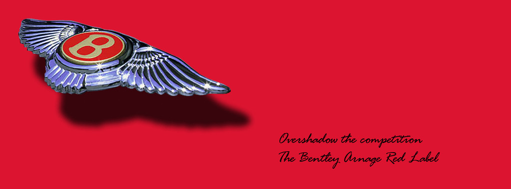
Before
After


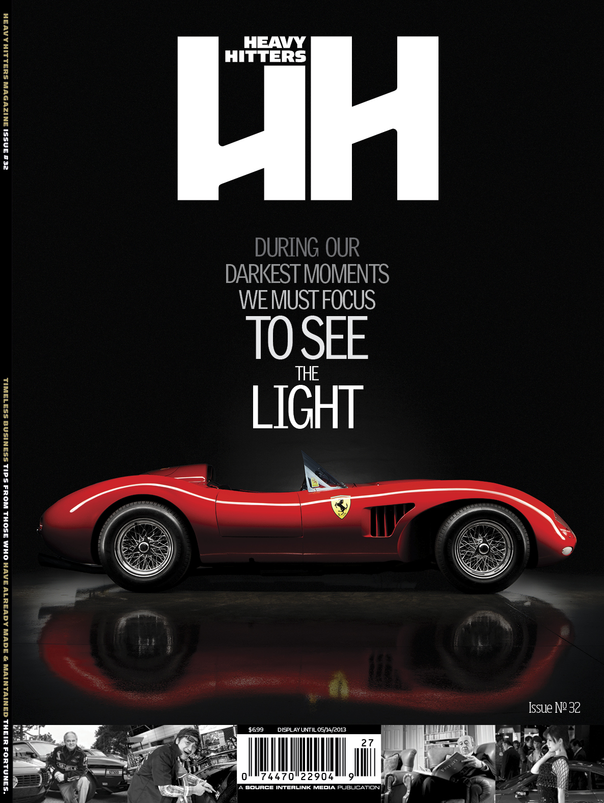
Sometimes a change of perspective is all it takes to see the light
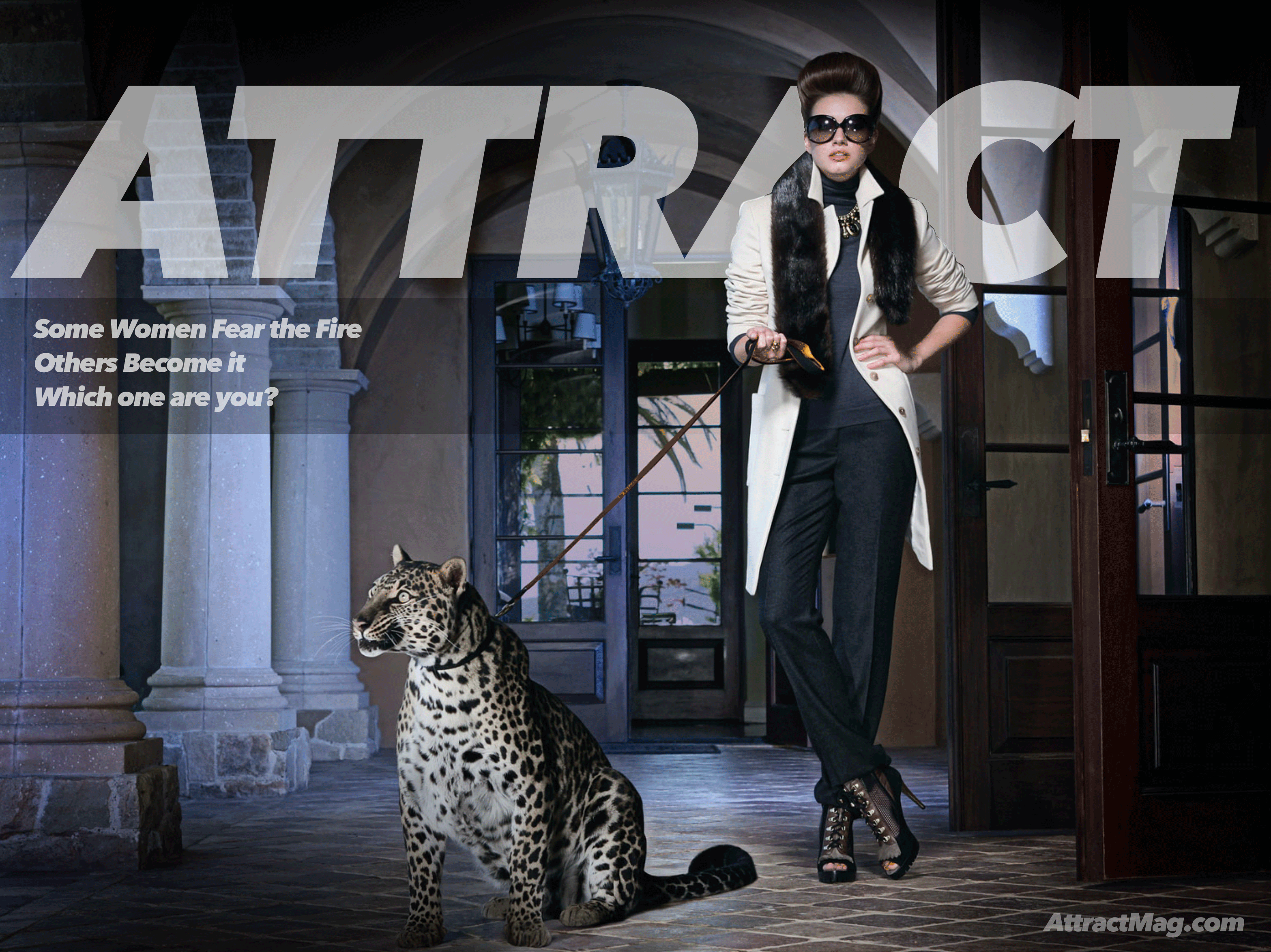
ABOVE: A client in the fashion industry photographed a model on a white backdrop. The image was void of feeling, so they contacted us to create two different banners and ad slogans for two separate marketing campaigns. They requested one banner to be bright and minimal and the other dark and mysterious.
Before
After
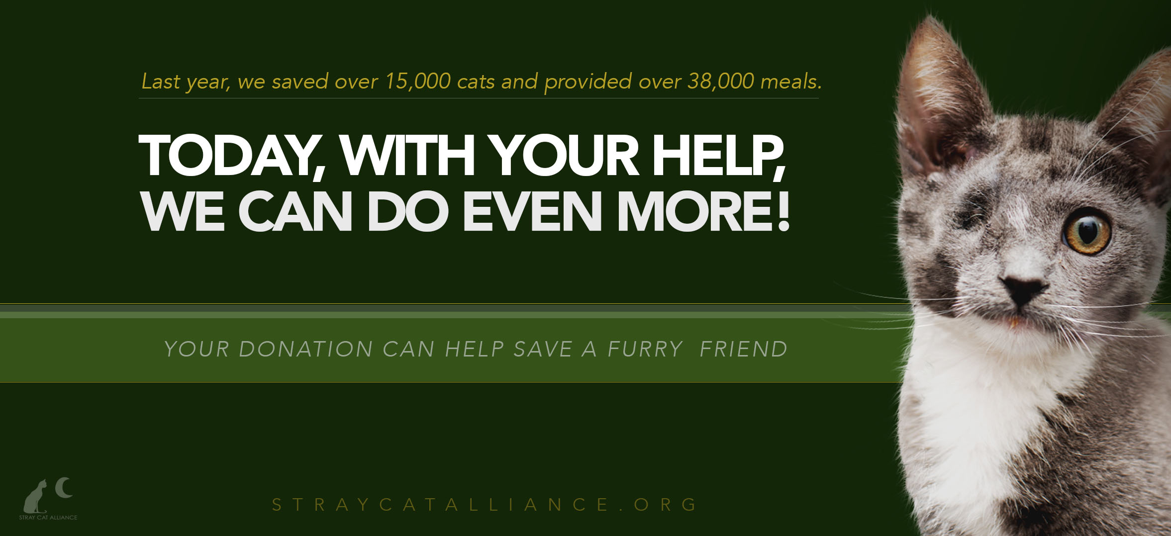
Before & After: To increase the effectiveness of a CTA (call-to-action) banner, this one was redesigned by first creating a slogan that provokes emotion; we also give the audience a reason why they should take the desired action by using facts, numbers, and a clear and direct CTA.
Visually, the former ad was lacking graphic detail. Customers would be quick to note the cat’s akward cropping, the lack of detail, and the drawn-in whiskers that look unnatural. Take note of the richer color of the cat, the redrawn whiskers, and the fine hairs all around the crop that have been redrawn.
Also, the background color of the CTA banner is changed to green. The reason? Psychologically, green is a color associated with healing and reliability. Interestingly enough, green evokes feelings of generosity, kindness, and sympathy, thus increasing the campaign’s effectiveness.
Below are some other CTA banners for use in their social media accounts.
Before
After

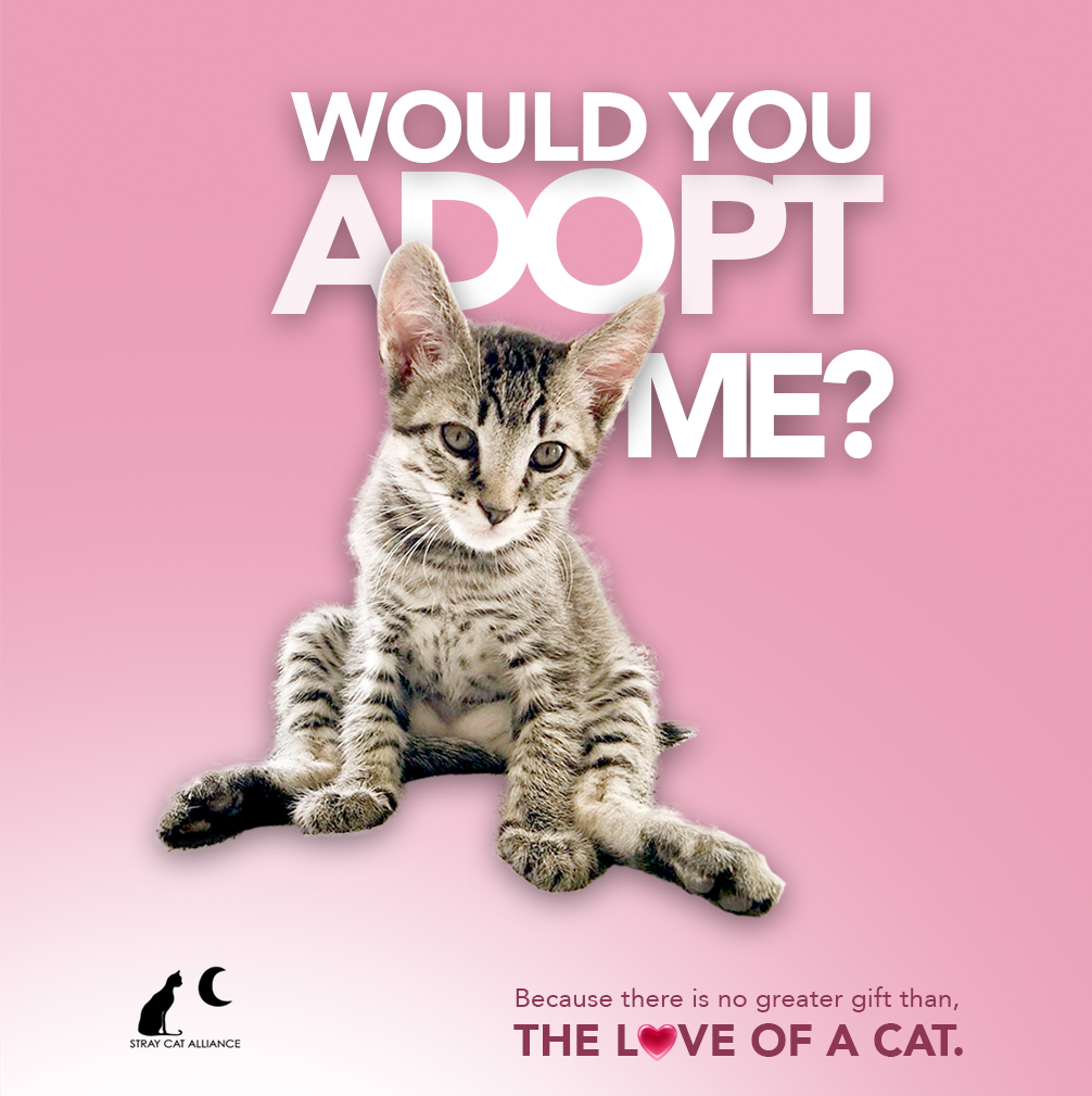
Before
After

